There are many styles and historically based styles that you can use in your home. Here are a few of the most common that are found in interior decorating. Traditional The traditional style is warm and homey yet has a sense of formality. The room layout is very balanced using a great deal of symmetry.… Continue reading Design Styles
Author: DecorSimplified
Harmony
The principle of harmony creates of sense of peace and an aesthetically pleasing feeling. Harmony in home decorating is the unifying factor of all the design principles, styles and color theory. When design principles are employed correctly harmony and unity are created. This room has a sense of harmony. There is a gentle contrast between… Continue reading Harmony
Emphasis
Emphasis relates to where the eye first rests in the design of your room. It is the first thing one sees before moving through the other elements of the room. The focal point dictates the rest of the layout of the space. Two types of focal points are common in home design, architectural emphasis and… Continue reading Emphasis
Rhythm
Rhythm in a room adds to the visual interest. Using different textures, patterns, shapes and color dictates where and why the eye moves throughout the room. There are four kinds of rhythm used in home decorating: alteration, repetition, contrast and progression. Alteration Alteration is alternating of two types of items. For example, using two pillows… Continue reading Rhythm
Balance
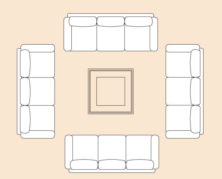
Balance in a room relates to the placement of items in the space and their relation to each other. Balance creates a harmonious and relaxing feel. When a room does not have balance it can appear disjointed or be uncomfortable. There are three common room layouts to follow for achieving a good sense of balance: … Continue reading Balance
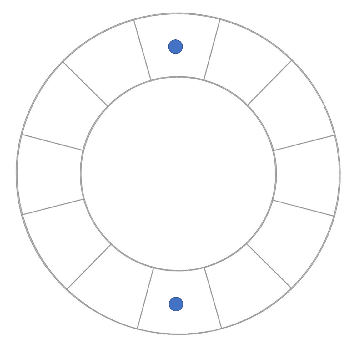
Triad Color Scheme
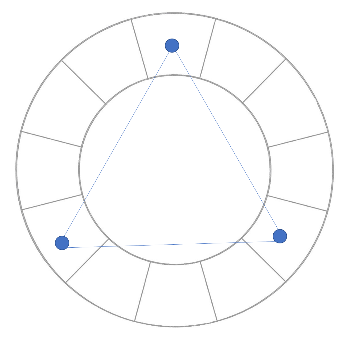
The triad color scheme is similar to the split-complementary in that it uses three colors. However, the three colors are spaced equally apart on the color wheel forming a triangle. If blue is your base color then the two additional colors are the two equal distance from blue on the color wheel. The pillows on… Continue reading Triad Color Scheme
Split Complimentary Color Scheme
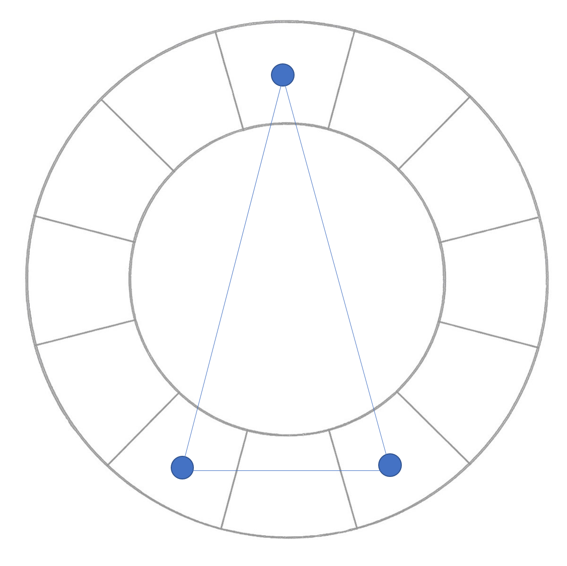
The split complimentary color scheme is similar to the complimentary color scheme but uses the two colors on each side of the opposite color from the base color. It results in a softer contrast than the complimentary scheme but the use of three colors adds to the quality of interest in the room. If your… Continue reading Split Complimentary Color Scheme
Analogous Color Scheme
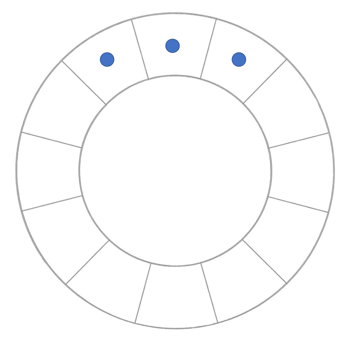
The analogous color scheme is represented by three adjacent colors on the color wheel. It creates a vibrant, yet extremely harmonious effect in a room. This color scheme works well if you want to create a lot of color interest in the room but not create intense contrast. It is harmonious but yet very interesting… Continue reading Analogous Color Scheme
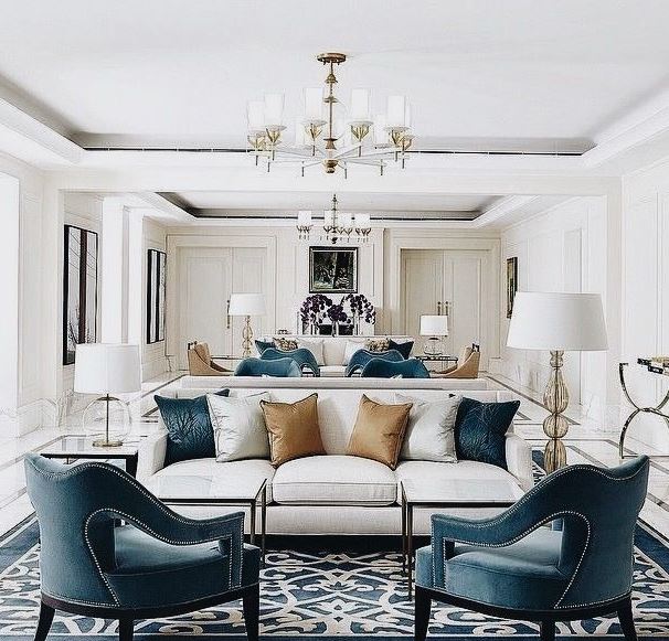
Complimentary Color Scheme
The complimentary color scheme uses two colors directly opposite each other on the color wheel. The two colors are harmonious but create a lot of contrast when used in interiors. If you choose for example blue as your base color then orange is the compliment. To reduce the intense contrast, use shades and tints of… Continue reading Complimentary Color Scheme
Monochromatic Color Scheme
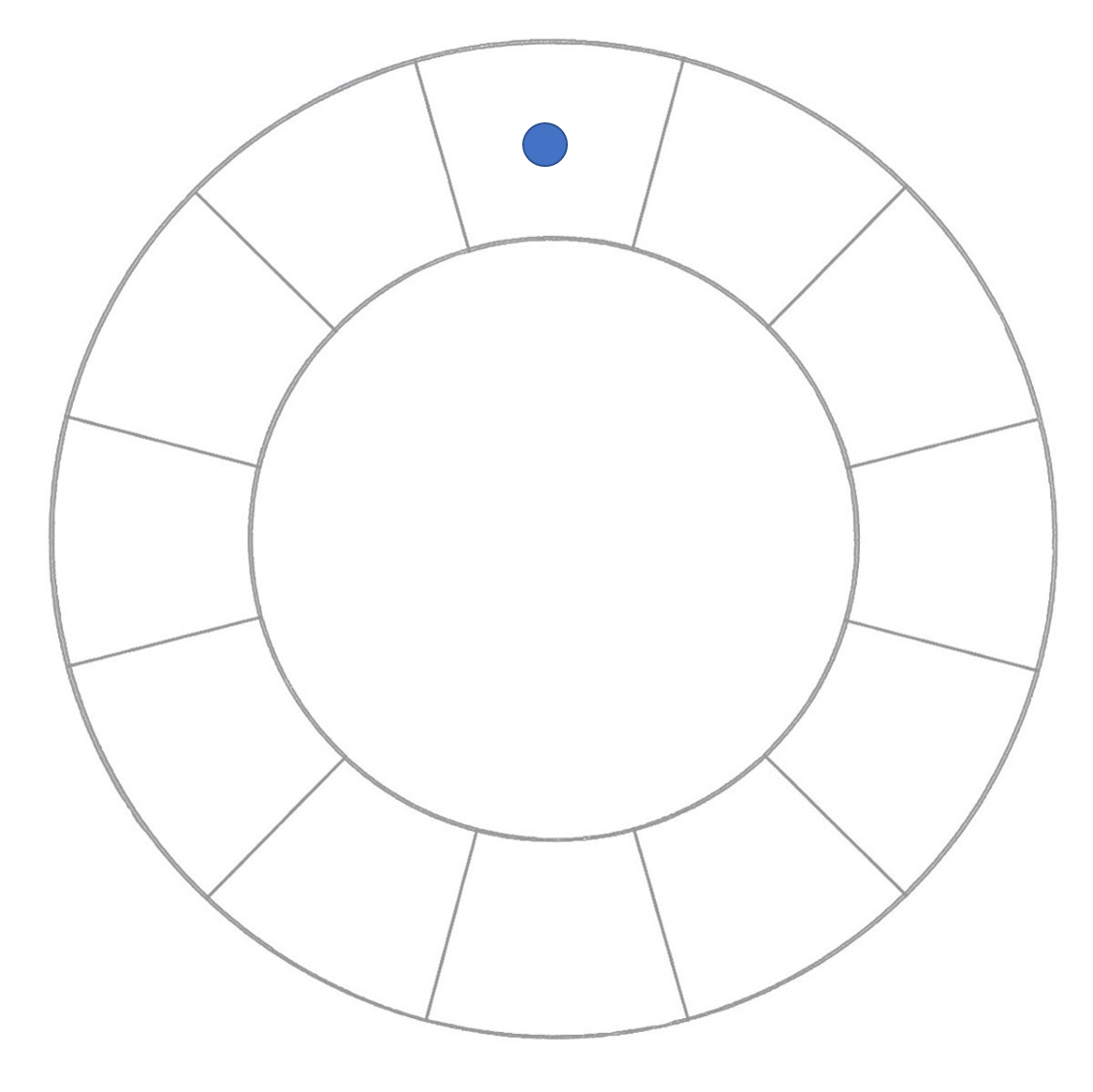
The monochromatic color scheme is the use of one color. Using shades, tints and tones a harmonious room can be created that still has interest and style. If your chosen base color is blue, then available to your design are the tints and shades of blue to create an interesting room. Here is a sofa… Continue reading Monochromatic Color Scheme
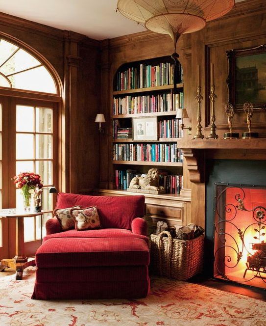
Center Chandeliers – a New Trend
In most homes it is unusual to find a central chandelier in the center of a room, unless it’s the dining room. Chandeliers were usually reserved for the dining area and ceiling fixtures were reserved for the bedrooms. A new trend is to use a chandelier or hanging lamp in living rooms and bedrooms. In… Continue reading Center Chandeliers – a New Trend
Cottage Style
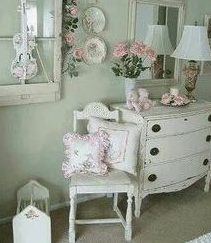
Cottage is warm and romantic. It makes one feel as if they are in a charming English cottage. The color palette is full of blush and rose adding to the romance of the style. Using vintage items, often painted white, with floral accents in upholstery, drapes and fabric, it is a decidedly feminine style. Accessories… Continue reading Cottage Style