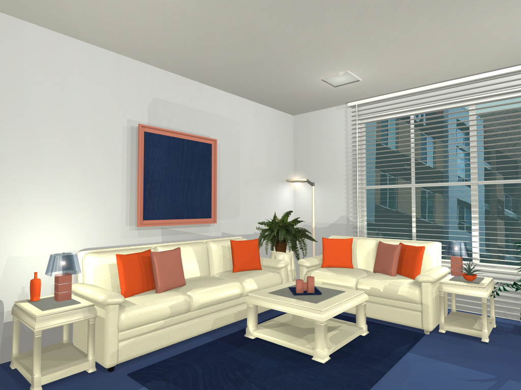
The split complimentary color scheme is similar to the complimentary color scheme but uses the two colors on each side of the opposite color from the base color. It results in a softer contrast than the complimentary scheme but the use of three colors adds to the quality of interest in the room.

If your using blue as your base color then the accent colors for the scheme are the two on either side of blue’s compliment, orange.
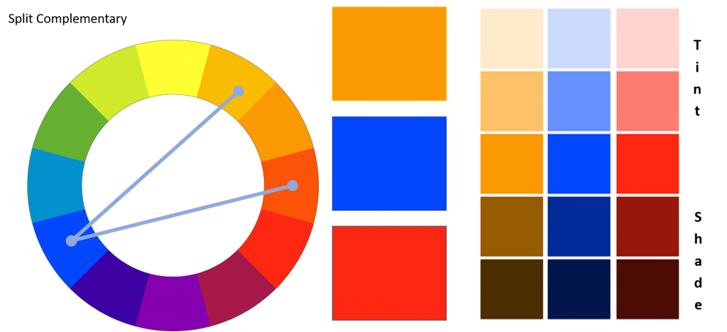
Using this color scheme adds a sense of vibrancy without having the extreme contrast found in the complimentary color scheme. As with all schemes, shades and tints can be used to create a softer effect.
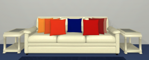
Depending on which shades and tints are used as accent colors the room can be very vibrant or more subdued.